 Plazarow Labs
Colour, scale and the feeling of a shared place
Art in a city-building game has two jobs that should support one another: create atmosphere and make the simulation readable. A warm neighbourhood can still communicate a clear hierarchy.
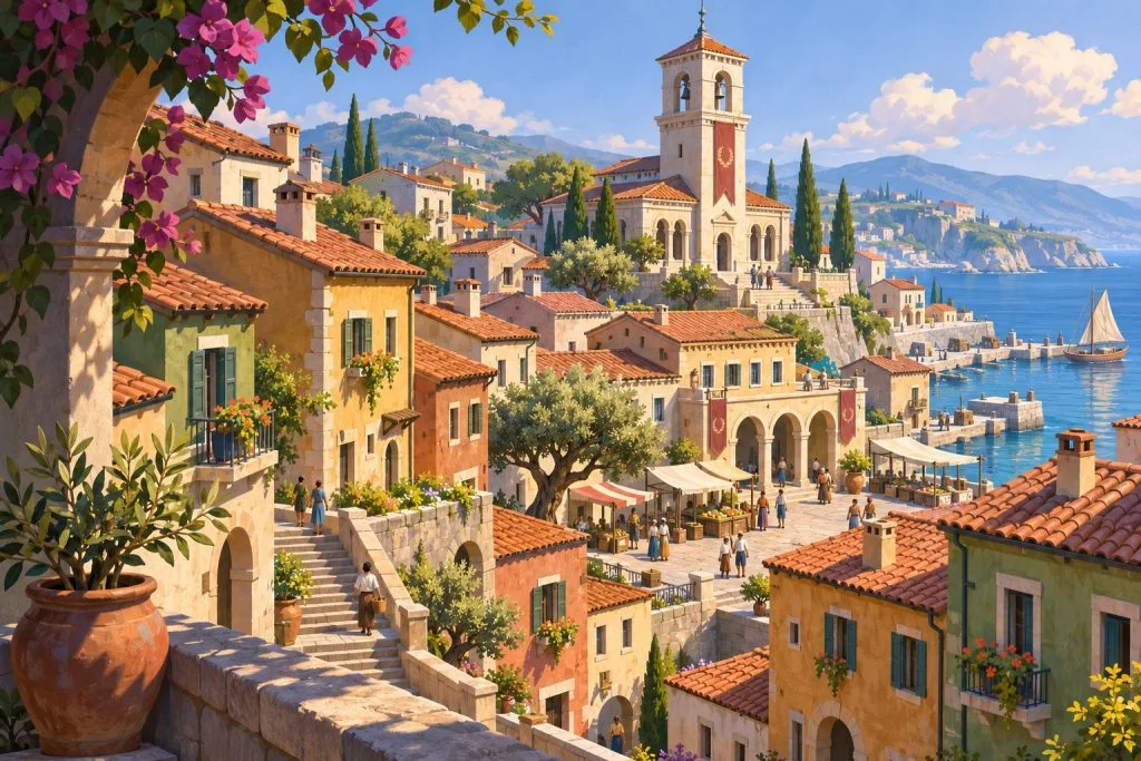
Start with the silhouette
We look for building forms that remain distinct at a distance. Shape and roofline can explain the role of a place before the player opens a panel. Small details should reward attention without becoming a requirement for understanding.
Use colour with restraint
A limited palette lets important elements stand out. Green space, active frontages and transport routes each need enough separation to read clearly, while still belonging to the same world.
Leave breathing room
Open space is part of the composition. A quiet edge or a wider street can give the eye a place to rest and help a busier area feel intentional.
The coastal neighbourhood artwork explores these principles. It sets a visual direction for our concept work while the interaction and simulation continue to evolve.